Tuesday, March 8, 2011

WEEK 1

Had my first lesson Today. HORRRAAY!!


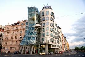
We began talking about different designers and began delving into research about designers within different movements. Designers were suggested to us, for our assignment. Frank Gehry was suggested to me, though his architectural designs are no short of amazing, and the way he breaks down conventions of structural definition through his use of Deconstructivism is really really cool, Frankly architecture does't really do it for me. 


Frank Gehry: Dancing House in Prague 


Then I stumbled upon Cassandre, an Art Deco poster designer. His works must be famous because they are familiar to me. His designs clearly transcend their time, and the influences of Cubism, Futurism and other abstract styles, make his designs trippy. I'd love to study more about him.   


WEEK 2 (Hurty On My Eyes)

Well today we delved deeper into the wonderful world that is Design history, we focused on early design technologies, techniques, and movements within certain time periods that shaped and changed graphic design into what we know it as today.


Design Techniques
We began by looking at how the development of technology directly relates to the development of the look of Graphic design. different techniques changed of graphic design was done, and used. inventions such as Gutenburg's printing press and then later variations revolutionised design, with the invention of typeface, which would begin the ball rolling. With the start of the industrial revolution, came the need for advertisement and the invention of such techniques as lithography. All these inventions and other such things as the typewriter and eventually the computer have made graphic design what is today and will build it to what it will be in the future.


Victorian Era
Frankly, four words 'hurty on My eyes'.


We looked at design within the victorian era, and in comparison to what design is today the designs of the victorian era are just plan nuts. 
Designs in the victorian were all about elaborate fanciness. In other words 'less is more' is completely thrown out the window. victorian designs were filled with ornate decoration. Their typography was usually on a curve and the drawings were detailed an realistic centring  on the perfect form, designs where symmetrical. 
Though as time moved closer to the Modern Era designs started to become more simplified, they also became more experimental and riske.  
Today companies like to revive victorian style designs to give their company the illusion of age.


ARTS & CRAFTS  
Finally we looked at the arts and craft movement.
This movement was a reaction against the poor aesthetic quality of the industrial Revelation in Great Britain.
It was a socialist reform movement, and was recognised as the bride between traditional victorian values and the Modern Movement. William Morris was the best known as the leader of the Arts and Crafts movement.
The Movement tried to re-discover the traditions that existed before the Industrial Revolution.


Any way. That was lesson 2 in Design history.   
     

WEEK 3 (Transcending the Line Between Reality and Madness)

Welcome back sports fans.


Todays Lesson was a fruit basket of interesting design Knowledge.
We stuck our teeth into wonderful the wonderful movements of Art Nouveau and Early Modernism.


First up in the batting order was Art Nouveau. Now Art Nouveau was direct descendent of our friend Arts and Crafts. Art Nouveau had the honour of being the first style of commercial art used consistently to enhance the beauty of industrial products. It was also the first international style to be embraced by all of Europe.


Here are some techniques embraced in Art Nouveau:


  • Curved soft shapes, rounded and bold.
  • Recreates organic shapes and patterns 
  • Hand made craftsmanship
  • Inspired by Japanese art.
TANGENT

The lesson was then suddenly blasted to the future to the far-out world of the sixties. This is because Art Nouveau found itself being recreated in Sixties Psychedelia. 

Brief Summery of Sixties Psychedelia:
  • Born in San Francisco 
  • Related to Psychedelic drugs taken by the youth of the era.
  • Posters captured the idea of the 'trip'
  • Pop Art movement apart of it.
  • Abstract images
  • Riske images.
BACK ON TRACK


So the second half the lesson was spent learning the wonders of early modernism. 


Early modernism was prominent between 1910-1935. EM artists were described as avon garde and experimental. bauhaus, Dada, Minimalism were prominent styles with in EM.


EM Involved a dissatisfaction of the past and the need for radical change. EM loved geometric shapes and hated ornamentation.


WEEK 4 (RAWR)

So today we learnt about Art deco, my favourite period.
Here's some stuff on cassandre one of the most prominent designers of the time.
The techniques used by Cassandre are what make his designs and creativity stand out amongst the Art Deco era and are what makes Cassandre such an influence of the period. Cassandre was religious in always beginning his design with the text and choice of type (which was often evented by him.) Cassandre deconstructed the figures of his designs into simple Illustrations based on geometric shapes, thus all illustrations and designs were based on geometric shapes. One of Cassandre’s most important contributions to graphic design was his belief in a total integration between image and text. Cassandre would romanticize the appeal of major forms of transport of the time, the car, the train and the ocean liner.  One of Cassandre’s more revolutionary ideas was the way he sold ideas, with use of motion and action, promoting the illusion of progress, rather than the things, or products themselves. 

WEEK 5 (A journey of wonder and surprise.)

Well patrons of the design world, this week was a wonderful treat. This week we had the pleasure of going on an excursion to the powerhouse museum.
The reason for this was to experience design up close from a range of different environments. Mainly we focused on The part of the museum reserved for the amazing Art Deco movement.


As you can see in this photo the powerhouse has parts of the beautiful Kings Cinema, just so we can lose our little designer minds over it. 


The cinema shows clear features of the Art Deco movement. Such as the geometric shaped structure, and stepping in the door frame.


What a fun day we had.       

WEEK 6 (Clash of the Titans)

Today we presented our first assignments, don't worry folks its not as bad as sounds. We presented reports on prominent Designers. My Designer was Cassandre, YAY, I HEART ART DECO. 


Here are some of Cassandre's works. 


WEEK 7 (Clash of even more Titans)

Nothing much to Report on this week Skipper, we just had the second lot of presentations. So here is a picture of a cat for your amusement.


AWWWWWWWW!!!! It's wearing a lime helmet.


WEEK 8 (HERO CHALLENGE)

Today we were given a challenge to test our research and analysis skills, so being the hero I am I said, "I accept your challenge."


So I decided I world research Jean Carlu a French poster designer in america. I focused on his 'America's Answer' poster.


Carlu used lithography because it was the cheapest way to mass produce posters.
The poster was affected by the second world war, right after america had joined. So Carlu's poster encouraged factory workers to work harder and longer, because this would mean they were doing their part for the war effort. The says all industry should go to the war.


So thats basically what i learnt today.


WEEK 9 (MAN DOWN!!!)

Unfortunately Dear Friends my Lecturer was sick, so i have nothing to post on. And if you don't like it... TOUGH TITTYS! 

WEEK 10 (Something about Nothing)

We started the lesson today watching a video on Milton Glaser.
So heres some stuff on His visual language to Keep you hunger for design at bay.


Milton Glaser’s visual language comes through his designs as didactic, giving the designs their purpose and effect. Glaser wants the viewer to take something away from the poster, hoping that viewer will learn and understand something from the design. In a hope that the viewer would understand the design and not misconstrue the meaning and purpose of the design, Glaser “exposes” him self to his viewer by including a explanation of his design. Glaser wants the viewer to be wowed by the genius of his design, and he doesn’t want his meaning lost.

Glaser wants his viewer to interact with the design, by getting the viewer to move around the design or within the design, or the time it takes the viewer to put together the meaning of the design.  


WEEK 11 (At The Movies)

Welcome Patrons of the Arts 

Today we watched a film on Helvetica, it was called Helvetica. (What, noway!?)

Yes way, the film was quite interesting, how can a film on a typeface be interesting you ask... well it just was! It was interesting to find out just how much of an impact Helvetica had on the modern world, and just how it is used in day to day life.

Also i was interested in finding out what prominent designers thought of the typeface.

Overall I give the film: 4 and a half stars.

A great film for the kiddies.


WEEK 12 (DESIGNER VS DESIGNER)

Well it has been brought to my attention that i have an essay due in the following weeks so today focused pretty much on that. We started by watching a film on Stefen Sagmeister, an experimental designer this was to help us on ideas for designers to write on.


So after much deliberation i decided i would compare Frank Miller and Nate Van Dyke. This idea was shutdown by my lecturer, so I'll get back to you on that.


I'm thinking Russian Constructivism, because I've been so into it lately.     

WEEK 13 (RED SON)

This week was spent on finishing our blogs and working on our essays. I've decided to use russian constructivist Rodchenko as one of my designers. I love Russian constructivism as much as i love art deco.


WEEK 14 (Say hi to your mum for me.)

THIS IS THE LAST POST FOR THE SEMESTER!!!! NOOOOOOO!!!!!
I just like to say thanks to my Mum. Mums are so freakin amazing.